The Two-Second Contract: What Overhead Motorway Signs Demand of Every Alert
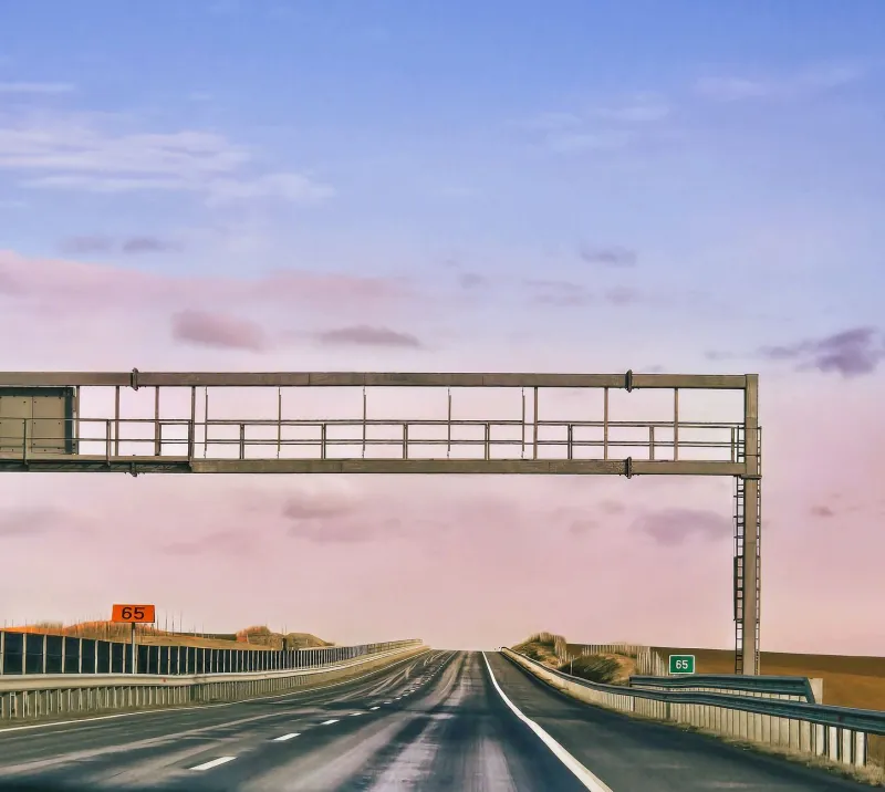
At 70 mph a vehicle covers about 31 metres every second. By the time an overhead gantry has entered a driver's useful field of vision, been recognised, and been acted upon, the sign has perhaps two seconds to make its case. That is not a reading task. It is a glance task. For information designers, the motorway variable message sign is therefore less a piece of roadside furniture than a masterclass in editorial restraint under extreme conditions.
The physics of the glance
A moving audience cannot re-read. It cannot scroll back, hover over a footnote, or ask a colleague what the third line meant. It catches a shape, a colour, a few words, and then the sign is gone. The design response is not simply bigger type. It is a ruthless reduction of what the sign is allowed to contain.
Many motorway variable message signs are engineered around a matrix of three lines and roughly eighteen characters per line. That is not a generous canvas. It permits a short instruction, a scope, and perhaps a qualifier. It does not permit a paragraph of policy, a legal citation, and an explanation of why the instruction exists. The character count is not an inconvenience to be worked around; it is the design brief.
The same constraint appears, less obviously, in every alert that must survive a moving audience: a phone notification glanced at on a train, a control-room banner seen across a desk, a station display read while walking, a dashboard tile caught between meetings. The question is not whether the message is complete. It is whether the necessary part lands in the time available.
Amber is a hierarchy, not a colour scheme
The amber text on a black background is not a brand choice. It is a contrast decision, and it works because it reserves almost all of the sign's visual budget for one channel: the letters. There is no photography, no decorative iconography, no secondary palette competing for attention. The hierarchy has to be built from wording, line breaks and position.
That produces a useful discipline. The first line should carry the action or the state. The second should carry the scope or the consequence. The third, if it exists at all, should carry only the qualifier that changes behaviour. A sign that begins with context and ends with instruction has inverted the hierarchy. A driver may never reach the end.
This is equally true of digital alerts. A dashboard that leads with a system name, then a timestamp, then a status, and only finally with the action required has spent its limited attention on decoration. The motorway sign suggests a different order: act, then explain. If the explanation cannot fit, it belongs somewhere else.
The brutal edit
Variable message sign copy is a lesson in what can be removed. Articles disappear. Auxiliary verbs are compressed. Verbs are front-loaded. Numbers are used only where they change a decision. Abbreviations are admitted only when they are universally understood by the audience in that place, at that moment.
The result can feel abrupt. It is meant to. A sign reading 'QUEUE AHEAD' does not need to say 'Please be advised that traffic conditions may be subject to delay'. The first version respects the glance. The second respects the writer's desire to sound thorough. Only one of those respects the driver.
For communicators, the practical test is simple. Show the message for two seconds. Then ask someone what they would do next. If the answer is vague, the message is not yet designed. If the answer is correct but the person cannot explain why, that may be acceptable in an emergency. If the answer is wrong because the sign tried to say three things at once, the edit has failed.
When completeness crowds out clarity
The tension is most visible on smart motorways, where a single gantry may need to carry a mandatory speed limit, a lane-specific prohibition, and an explanatory qualifier. The red X is legally and operationally necessary. The speed limit is enforceable. The additional text may be there to satisfy a requirement rather than to change a driver's immediate behaviour. The sign becomes a compliance document viewed at speed.
That is the trade-off worth naming. Legal completeness has a place, but it is not always the same place as the glance. Where a sign must carry multiple obligations, sequencing matters. One gantry can prepare the driver; the next can instruct. Complementary channels can carry the explanation. The moving sign should not be asked to do every job at once.
The design question is not 'What must be stated?' alone. It is 'What must be understood now, and what can be understood later?' A sign that is legally complete but operationally ambiguous has traded clarity for coverage. The same failure appears in dashboards that list every caveat and hide the one number that requires action.
Designing for the moving audience beyond the road
The motorway gantry offers four transferable rules. First, front-load the action. The first visible unit of information should tell the audience what to do or what has changed. Second, reserve colour. If everything is highlighted, nothing is. Third, design for the shortest plausible exposure, not the longest. Fourth, separate the mandatory from the explanatory. The mandatory belongs in the glance; the explanatory belongs in the detail layer.
Accessibility sharpens these rules. High contrast is essential, but colour alone should not carry meaning. Amber on black is effective, yet a status that exists only as a colour will fail some viewers. Text should remain legible at distance and in poor conditions. Motion should not be the only cue. The aim is not a sign that looks dramatic; it is a sign that survives the conditions in which it is actually seen.
For UK communicators, the overhead sign is a useful corrective to the dashboard habit of accumulation. We tend to add: another metric, another caveat, another label. The gantry cannot add. It must choose. That constraint is not a limitation to be resented. It is the discipline that makes the message travel.
The best motorway signs are not the ones that say the most. They are the ones that have decided what matters before the driver arrives. That is the two-second contract: the sign promises to be understood in the time available, and the designer promises not to waste it.